It is normal to be “not-normal”: reporting of correct descriptive statistics in dental research
Article information
Respected Editor-in-Chief
Statistical analysis forms a crucial part of any research and aids in decision-making. It has been observed that data from health research usually do not follow the standard “normal distribution,” and thus are skewed [1]. However, of late there has been a rise in the incorrect reporting of statistical indicators, which ultimately obscures the validity of the research. A normal distribution refers to data where the observations lie symmetrically around an unknown point, forming a bell-shaped curve, whereas a non-normal distribution may lack symmetry, may have extreme values, or may have a steeper or flatter “dome-shape” than a typical bell.
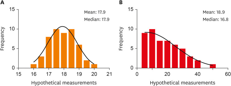
It has been noted that researchers without evaluating the nature of the distribution, i.e., whether the distribution concords with a normal distribution, report the descriptive statistics using mean and standard deviation as a measure of central tendency and dispersion respectively. Also, they utilize tests meant for analyzing “normally” distributed data. However, these descriptive statistics may not be applicable and often misleading for skewed data, as it is highly influenced by extreme values. Figure 1 exemplifies two hypothetical data sets plotted in a histogram showing normal distribution and skewed distribution.

Histograms of normally distributed and skewed data (hypothetical data generated digitally with n = 50 each). (A) Normally distributed data and (B) skewed data.
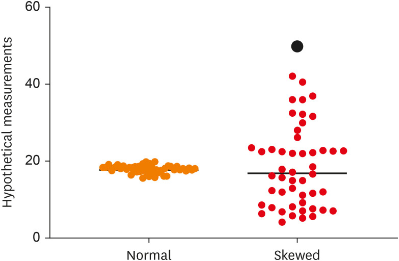
In such cases, when observations do not pile up a common point, and evident “outliers” are present, it is desirable to report the measure of central tendency as median as it is not influenced by extreme values [2]. Outliers tend to make the distribution highly dispersive which has been depicted in Figure 2. The measure of dispersion can be reported in terms of the interquartile range. It is calculated by dividing the observations into quartiles, where the first quartile denoted by Q1 holds 25% of the values below it and the third quartile (Q3) holds 75% of the data below it, and taking the difference between the first and the third quartile (Q1–Q3) [3].

Scatter Dot Plot showing the data dispersion in normally distributed data (blue) and skewed data (red) with the black horizontal line at the median. Note the amount of clustering of observations around the median value in the case of normally distributed data and the amount of dispersion in skewed data with an outlier (black dot).
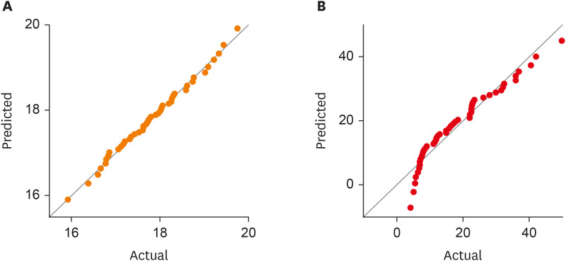
It is recommended that researchers report the nature of distributions of their variables, which can be either done by eye-balling at the simple histogram or plotting a normal distribution or a quantile-quantile (Q-Q) plot. Figure 3 illustrates Q-Q plots showing observations from normally distributed data and skewed data. Formal tests to assess normality like the Kolmogorov-Smirnov tests or the Shapiro-Wilk test can also be carried out with the null hypothesis that the variable follows a normal distribution and p values above the threshold (usually 0.05) suggest normality. However, one must remember that these tests are highly sensitive to extremely large samples and should be used with histograms and normality plots [2].

Quantile-Quantile(Q-Q) Plot of two hypothetical data sets. (A) Normally distributed data and (B) skewed data. Note that observations lie on or around the theoretical normal line in the case of normally distributed data, while in skewed data, the observations form a curve or an “S”-shape around the theoretical normal line.
Researchers must acknowledge that summarizing measures applicable for “normally” distributed data may be misleading when pragmatized to non-normal distributions, and reporting the correct indicators may augment the quality of research and significantly contribute to the reduction of the production of low-quality articles.
Notes
Conflict of Interest: No potential conflict of interest relevant to this article was reported.
